The First Ideas You Should Let Go of in App Design
Before an app looks beautiful, it must clearly communicate what it does.
Posted by: Gia Grace
Why do so many apps lose users on the first screen?
When users open an app for the first time, they don’t stop to admire the design.
Within a few seconds, they decide what kind of app this is, what value it offers, and what they should do next.
Many apps fail at this very first moment.
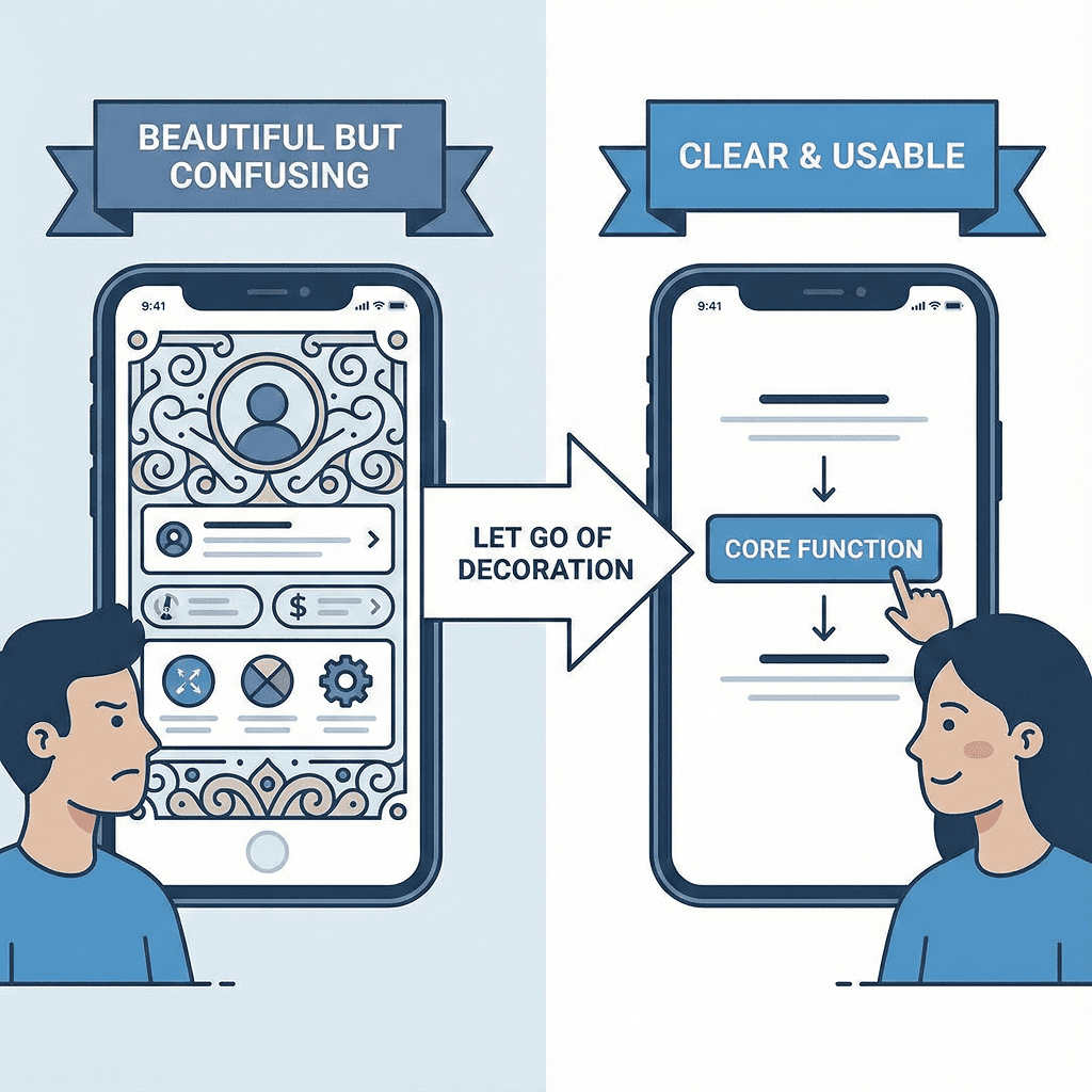
The screen may look clean and the color palette may be fine, but it’s unclear what the app is actually for.
There are too many buttons, the text is too small, and information is scattered across the screen.
As a result, users close the app before they even understand its features.
The issue isn’t poor design—it’s misplaced design priorities.
A Shift in Thinking: App design is about clarity, not visual perfection
Making an app look good and making it easy to use are two very different things, yet many teams confuse them.
Aligning layouts and unifying colors may feel like “better design,” but users still get lost.
The reason is simple: the design was built around visual polish, not clarity.
The starting point of app design should not be aesthetics, but understandability.
The core function of the app and the first action the user should take must be immediately clear from the screen structure. Without that, even the most refined visuals quickly fail in usability.
Decision Criteria: Common design mistakes that hide the core function
Many apps repeat the same mistakes.
Secondary features are given more visual weight than the core function, or important buttons are pushed to less visible areas in the name of visual balance.
Text is made smaller to keep the screen “clean,” forcing users to concentrate just to read.
Some apps overuse icons and colors to appear visually appealing, which ends up blurring the focus of the screen.
These designs may look organized, but they make it difficult for users to grasp the app’s purpose at a glance. This is the moment when design starts to obscure functionality instead of supporting it.
The risk of ignoring category and identity in design
Not all apps should be designed the same way. Financial apps must prioritize trust and stability.
Healthcare apps require clarity of information and calm, deliberate flows.
Shopping apps should be structured so products stand out clearly, while community apps need smooth exploration and interaction.
Yet many apps ignore these category-specific needs and simply copy trendy designs or layouts from other services.
The result is confusion—users can’t intuitively understand what kind of service the app is.
Individual design elements may look good, but together they create a visual dissonance that doesn’t match the app’s identity.
Conclusion: Good app design reveals both the core function and the identity
Good app design places the core function in the most visible position and creates a flow that allows users to act without hesitation.
Colors, typography, and button styles then build on top of that structure to complete the app’s identity.
When this order is reversed, design becomes decoration and usability is sacrificed.
But when the structure is built around the core function and category first, the design naturally falls into place and the app’s character becomes clear.
Ultimately, design is not about looking good—it’s a tool for clearly communicating what the app is and what it’s for.
Summary
The first thing to abandon in app design is the obsession with looking beautiful.
Design should begin with making the core function immediately understandable and guiding users to act naturally.
Colors, fonts, and visual elements that match the app’s category and identity come afterward.