Why App Design Must Differ by Category — AppBuildChat’s Category-Specific Design Principles
When an app’s purpose and the user’s emotional flow change, its design language must change as well. AppBuildChat applies refined category-specific UX/UI principles through Human + AI collaboration.
Posted by: Gia Grace
Why must app design differ across categories?
App design is not simply visual decoration—it is a structure that reflects the user’s emotional state and intent right before they use the app.
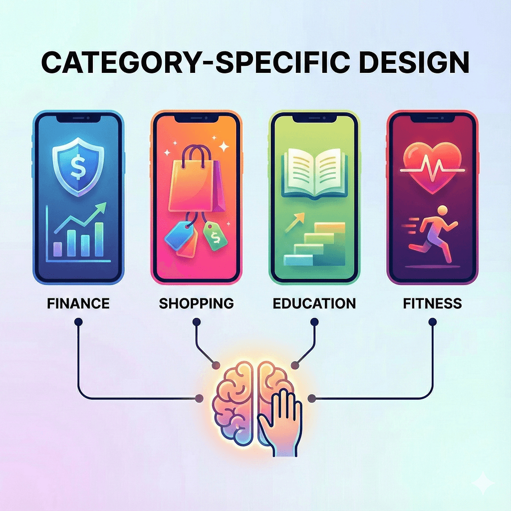
Categories such as finance, education, shopping, and fitness all require completely different user behaviors and emotional directions.
If the same design language is applied across them, users inevitably feel confused.
AppBuildChat recognizes these differences as essential and maintains a natural user experience by applying category-specific design principles through Human + AI collaboration.
Why do finance apps require a “stable” design?
The most important emotion for users when opening a finance app is trust.
Because they are dealing with money-related information, they expect a visually calm and stable environment.
For this reason, finance apps typically use deep blues or neutral tones and minimize decorative elements, focusing instead on information-driven structure.
AppBuildChat’s designers refine the screens with these emotion-based principles so that users feel, “This is an app I can trust.”
Why are shopping apps more vibrant and dynamic?
Users of shopping apps are in a state of exploration and discovery. They browse, compare, and search for items that catch their attention—so the design needs to naturally draw the eye.
Strong accent colors, large image banners, and fast-navigation UI elements support this behavior.
AppBuildChat’s Human Layer adjusts visual rhythm based on AI-generated UI and designs detailed elements so that users feel, “This is a place I want to browse.”
Why do education apps need friendly and step-by-step structures?
The purpose of education apps is understanding and repetition. Users come to absorb new information, so the interface must minimize complexity and present a clear information structure.
Learning flows often need step-by-step guidance or progress-tracking UI so users don’t get lost.
AppBuildChat designers consider these learning patterns and refine spacing, typography, and layout to create a flow where users naturally move to the next step.
Why must fitness apps be energetic and intuitive?
Fitness apps are designed to drive action. Users do not have time to read and think through every button.
Therefore, strong contrast colors, clear buttons, intuitive graphs, and fast feedback UI are essential.
AppBuildChat’s designers reflect this immediacy by removing distracting elements and adjusting design tone to maintain a movement-focused experience.
How does the Human + AI approach make category-specific design more precise?
AI first generates a basic UI structure based on category patterns—but this is only the starting point.
The Human QA Layer’s designers then analyze whether the AI-generated structure truly aligns with the emotional and functional needs of that category, adjusting screen flow when needed.
By combining AI’s speed with human interpretation, the design language naturally adapts to each category, resulting in cleaner and more intuitive user experiences.
Ultimately, what effect do category-specific design differences create?
The biggest impact is how quickly users understand the app.
Through design, users instantly sense the app’s character and intuitively grasp what behaviors the app expects from them.
When design matches the category, confusion decreases, features become clearer, and overall UX satisfaction increases.
AppBuildChat actively incorporates these category-specific differences to ensure each app’s purpose reaches users as quickly and accurately as possible.